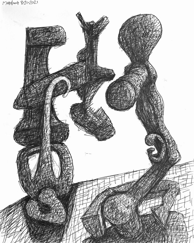
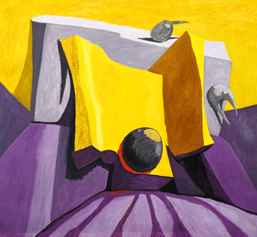
 Drawing 08·31·2021, pencil on paper, 20x16 inches In yesterday's post I invented a new phrase: "Referential Representation." Perhaps this is inaccurate; I am having second thoughts concerning its accuracy. A better phrase may be Abstract Representation. My work is abstract. My Art can be comprehended as non-representative. It can be seen as abstract because it is abstracted from my reality. My Art represents my intellectual and emotional reality. The drawing I show today is based upon emotionally representative images; these images float in my psyche and memory. All my recent Art are transformed feelings and thoughts; internalized images transformed into representation, This is my mediative practice of Art-Making. My Art-Making is Abstract Representation, also Referential Representation. My Art does not represent walk-around, visual reality, but feelings and visual memories. Art covered by the umbrella that is called "Abstract Art" is a sliding scale of images. Total Abstraction bears no trace of any reference to anything recognizable. Partial Abstraction takes liberties, altering color and form in ways that are conspicuous. My Art is neither Total Abstraction or Partial Abstraction. My phrase, Abstract Representation, refers to images we all have seen and know. Does the phrase "Referential Representation" work as well? I have to mull on this. Abstract Art (from Wikipedia)  "Fool's Cap Too Long" (2021 No.6, state 3), oil on canvas, 63x57¾ inches, {"We swim, day by day, on a river of delusions.... But life is a sincerity. In lucid intervals we say, 'Let there be an entrance for me into realities, I have worn the fool's cap too long.'" - Ralph Waldo Emerson (1803-1882), "Use of Great Men," from the collection of essays, "Representative Men" (1850)} Freedom ain't free, you know. Knowledge ain't unencumbered, you know. Finding one's significant other ain't easy, you know. This painting is a step in the right direction.
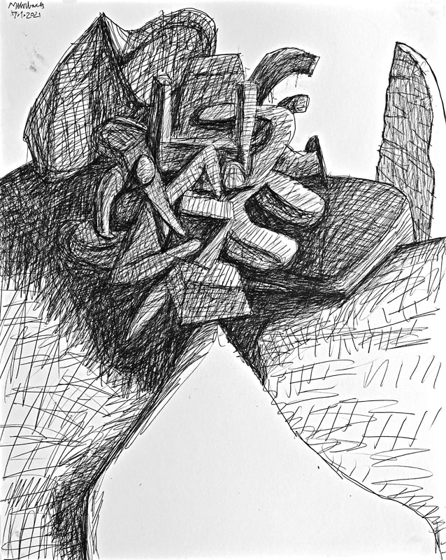 Drawing 07·01·2021, pencil on paper, 20x16 inches  "Fool's Cap Too Long" (2021 No.6, state 2), oil on canvas, 63x57¾ inches, {"We swim, day by day, on a river of delusions.... But life is a sincerity. In lucid intervals we say, 'Let there be an entrance for me into realities, I have worn the fool's cap too long.'" - Ralph Waldo Emerson (1803-1882), "Use of Great Men," from the collection of essays, "Representative Men" (1850)} This is going to end well. Getting there is the mystery that is defeating self-foolery. My dilemmas are many. I am going to kick the out, one at a time, perhaps several per day. Follow me and you shall see.
 "Fool's Cap Too Long" (2021 No.6, state 1), oil on canvas, 63x57¾ inches, {"We swim, day by day, on a river of delusions.... But life is a sincerity. In lucid intervals we say, 'Let there be an entrance for me into realities, I have worn the fool's cap too long.'" - Ralph Waldo Emerson (1803-1882), "Use of Great Men," from the collection of essays, "Representative Men" (1850)}  Drawing 06·30·2021, pencil on paper, 20x16 inches I am working hard to find my realities. Here comes the painting, "Fool's Cap Too Long." Also, yesterday's drawing strives to find bottom-line reality, exhibited visually without falderal, without annoyance. Do these work perfectly well to illustrate my reality? Not yet. More work coming...
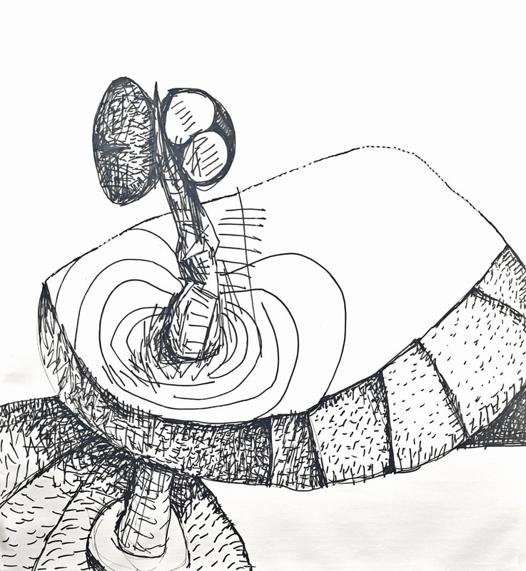
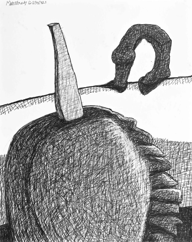 Drawing 06·29·2021, pencil on paper, 20x16 inches 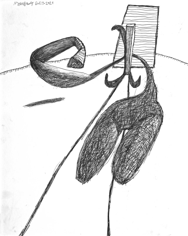 Drawing 06·27·2021 (state 2), pencil on paper, 20x16 inches I am looking for the special sauce, the stuff that immediately engages viewers. I am looking to stir spices into the visual palette, looking for spices that engage. I need to play around, to mix in new spices, take others out. I am a chef, mixing up variations, seeking the potent mix that pulls viewers in, keeps them married to my work, keeps them wanting more. Thus came state 2 of the drawing from 6/27/2021, which is much better than the original version. Now I am looking at yesterday's drawing. I think the upside down U-Shape (in the upper right) would be better if smaller. Maybe I am wrong. Maybe I am right. And so it goes...
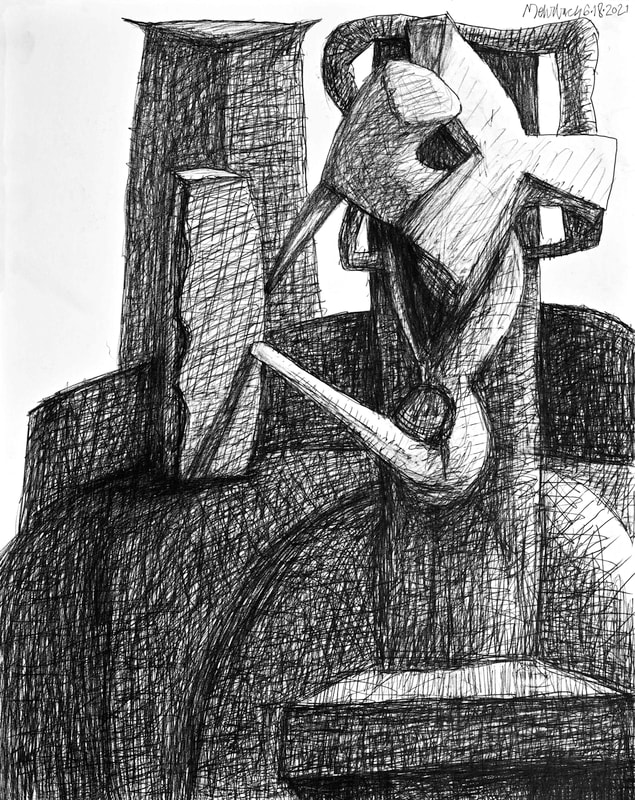 Drawing 06·18·2021, pencil on paper, 20x16 inches The force of my will made this one. It is apropos of my need to grab your attention, grab my attention. I center you, I center me, by using strong vertical forms. Somehow, when I was finished with this drawing, I was reminded of Picasso's "Crucifixion" from 1930. I believe it to be one of Picasso's most remarkable works, different as it is in color, space, and forms from anything else Picasso. Yes, in this crucifixion there is relationships to everything Picasso had done, and would do, but Picasso's approach here is quite different. The viewer is centered by the light-valued blue of the Christ figure and his distraught mother. After this centering, the viewer can wander, be continuously surprised by the complete animation, the literal references, within the composition, one after the next. My drawing is simpler, yet equally haunting. This bring me to the question of background. There is blank paper in my drawing. Does that work? I usually like to touch every surface. I usually feel the need to identify every part of my paper's surface as part of my space, my time, and my composition. That did not happen in this drawing's background. Does it work? There is a bold, forceful grab here: the viewer is captured by strong, vertical forms, I do believe the white paper ground serves its contrasting purpose. I see the white as definitive space; it is the flat plane in front of which the rest of the composition resides. Notice how Picasso dealt with his background and the negative space; four flat colored areas: blue, yellow, orange, red. Is the viewer bothered by these unidentifiable spaces? No! Instead the multiple compositionally positive forms grab and install the viewer within the composition. The forms are strong enough to support the vague spaces and surfaces Picasso's flat colors depict. 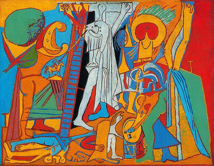 Pablo Picasso, "Crucifixion", oil on panel, 1930 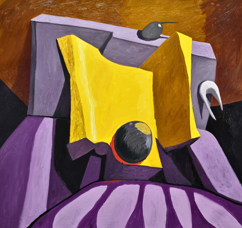 "The Opposite of Indifference" (2021 No.4, state 11), oil on canvas, 54x51 inches, {"The opposite of love is not hate, it's indifference. The opposite of art is not ugliness, it's indifference. The opposite of faith is not heresy, it's indifference. And the opposite of life is not death, it's indifference. Because of indifference one dies before one actually dies. To be in the window and watch people being sent to concentration camps or being attacked in the street and do nothing, that's being dead. His or her neighbor are of no consequence. Their hidden or visible anguish is of no interest. Indifference reduces the Other to an Abstraction." - Elie Wiesel, "US News & World Report" (27 October 1986)} 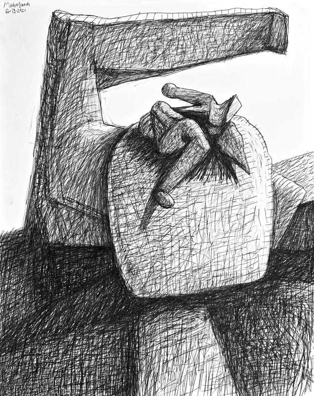 Drawing 06·13·2021, pencil on paper, 20x16 inches I am, as always, fascinated by reality. I am fascinated by the reality that a picture requires an obvious sign-like center to be heeded. Compositions with a core center insist upon being viewed. Compositions with an obvious center of attention insist upon being taken seriously. Seriously! I don't have to tell you. You have been drawn into the images I show you today, including a painting by Jean-Michel Basquiat. My painting, "The Opposite of Indifference", does need more work to fully smack your eyes into a center of attention. That will happen today.  Jean-Michel Basquiat, "Earth", oil on canvas, 167.6x152.4 cm 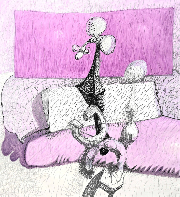 "Gonna Speak to the Crowd" (2021 No.5, state 3), oil on canvas, 62¾x57⅜ inches, {"I'm gonna spare the defeated — I'm gonna speak to the crowd. I'm gonna spare the defeated, boys, I'm going to speak to the crowd. I am goin' to teach peace to the conquered. I'm gonna tame the proud." - Bob Dylan, "Lonesome Day Blues" (2001)} The same thing that saves people's backs from suffering pain is necessary in good paintings. If design is strongly centered the possible pain of confusion gets swept away by clarity of engagement. This is happening in "Gonna Speak to the Crowd", which is aptly titled. I am working hard to make this one speak directly to my crowd of viewers. No more futzing around for robust form and space, which can be confusing because ardent searches are ripe with confusion. I am going for center, for engagement through centrist clarity.
 Drawing 06·01·2021, pencil on paper, 20x16 inches Perhaps the main job of art-making, also viewing art, is to center us. This can be done with calm introspection, Piet Mondrian comes to mind. Or, it can be done with rambunctious bravado, and flair, such as the work and life of Vincent Van Gogh. I am in the latter camp. I enjoy enthusiasm, and energetic interaction, in the process that is my art-making. I want the. viewers of my art to feel the same. However, centering is becoming more important, more imperative. For years I misunderstood my own needs. My intent got distorted, it became removed from the reality of working toward a controlled center. Centering is required for the human spirt to thrive. Centering is as exhibition of mindfulness and human dignity. Yesterday's drawing recognizes this. All my work going forward will recognize the human quest for center.
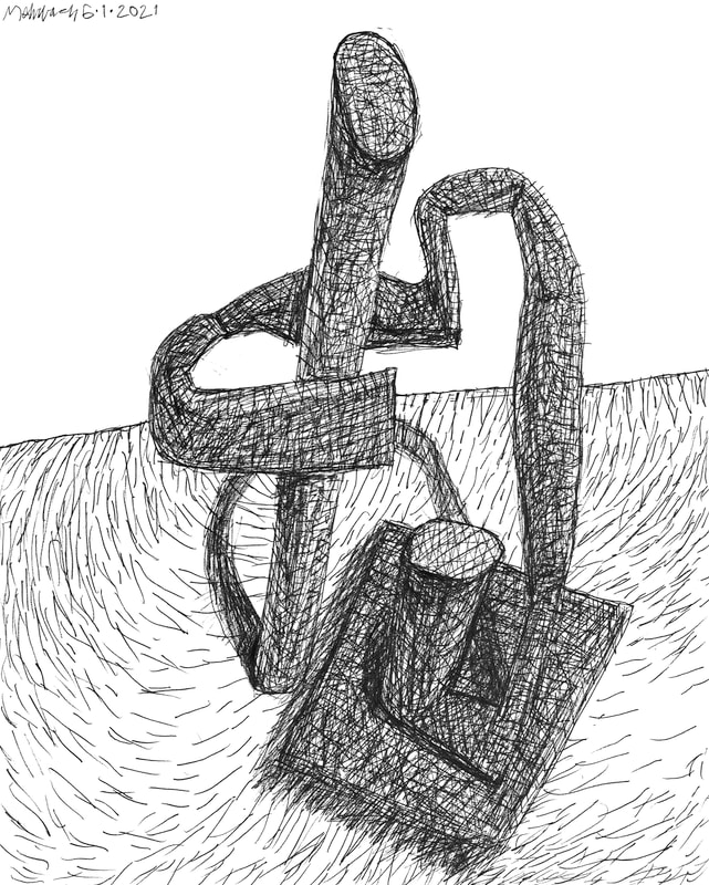
 "The Opposite of Indifference" (2021 No.4, state 06), oil on canvas, 50x54 inches, {"The opposite of love is not hate, it's indifference. The opposite of art is not ugliness, it's indifference. The opposite of faith is not heresy, it's indifference. And the opposite of life is not death, it's indifference. Because of indifference one dies before one actually dies. To be in the window and watch people being sent to concentration camps or being attacked in the street and do nothing, that's being dead. His or her neighbor are of no consequence. Their hidden or visible anguish is of no interest. Indifference reduces the Other to an Abstraction." - Elie Wiesel, "US News & World Report" (27 October 1986)} 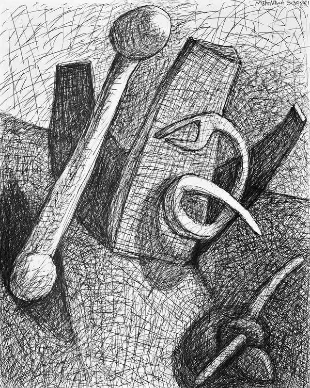 Drawing 05·30·2021, pencil on paper, 20x16 inches Doggedly I am in pursuit. Pursuit of the "what" is not clear, nor should it be. I will know it when I see it (if I ever see it). These steps I take are ones in self-knowledge. Goodness and purity are felt, never fully seen in my own work. I know they exist. I have seen them in other artists' work. My belief in myself, the possibility of my being successful, is relentless. I am sure this is the way John Coltrane felt. I keep going back to do more work because I know a little tweak will get me closer to full realization that is my own depth.
Yesterday's work, the drawing and painting, were good, solid steps. I felt ground, but that ground has a little squish to it. |
To read my profile go to MEHRBACH.com.
At MEHRBACH.com you may view many of my paintings and drawings, past and present, and see details about my life and work. Archives
April 2024
|
 RSS Feed