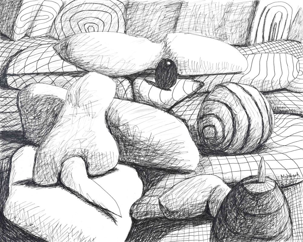
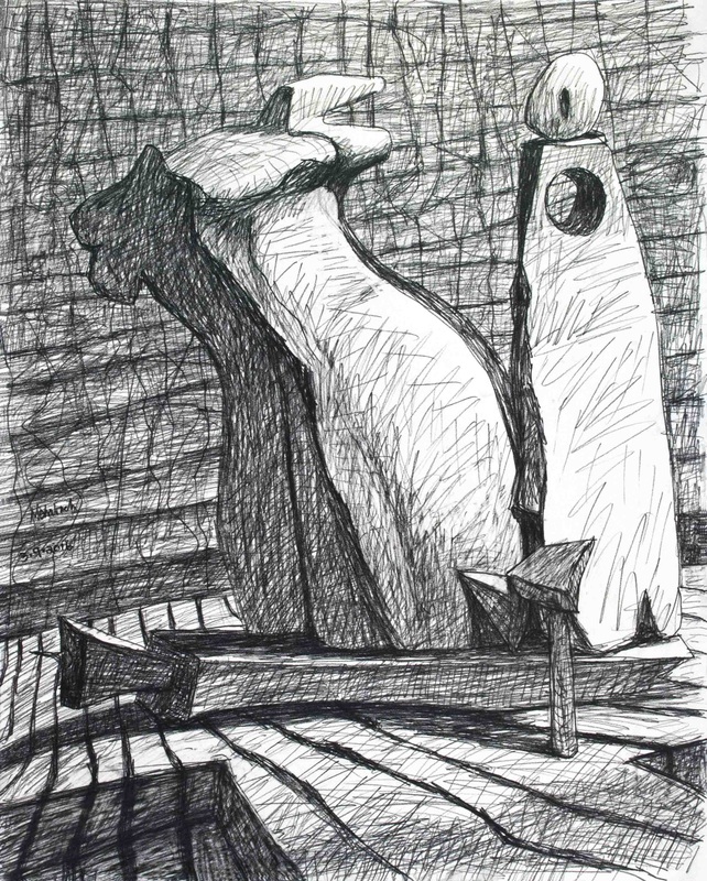
 Drawing 02·01·2017, pencil on paper, 16x20 inches Yesterday's drawing is centered by a black ovoid with a specular spot. My specular spotting goes back to my earliest three-dimensional abstractions. A friend of mine noted the painting "2017 No.3" has specular highlights, he thinking this unusual for my recent work. Not sure about that, but his comment did give me pause. I love specular highlights. I don't use them enough. I enjoy what a specular highlight can do for the third dimension of a form. As you know, the artifice of three-dimensions on two-dimensional surfaces is very important to me. Yesterday's drawing is a reaction to my friend's comment about the specular highlights in "2017 No.3," thank you very much! Definitely more specular highlights are coming! 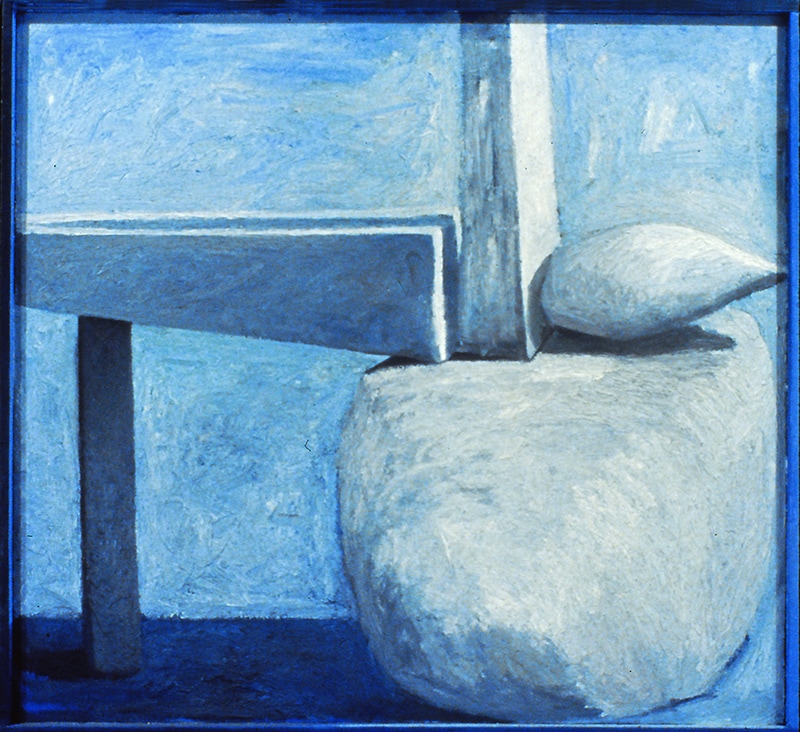 "Balanced Forms No.7", oil on canvas with painted frame, 1986  "2016 No.16" (state 6), oil on canvas, 64.5x54.5 inches The process is becoming more, and more, "call and response." My ability to hear the call, my ability to distinguish the nuances in the language, my acuity, has increased. "To hear" is not an accurate description. The difference is actually one of visual acuity, which is better described as intellectual acuity. If you go back, look at "State 5" of this painting, "2016 No.16", you can see my responses to the calls. For instance, the color at the top of the painting. That which was orange is now covered with a mix of yellow ochre, cadmium yellow, and white (some of the old cadmium orange is allowed to show through the newer paint). My responding is nothing new, but my confusion, in regards to how I should answer, has diminished. I know better where to go. Yesterday's drawings are dramatically fresh in their play of flat versus round. The relatively flat "bone-like" form in No.1 is filled with rounded protrusions. Fascinating to me is how this play gets carried into drawing No.2, which is spatially different (it is more forceful in the third-dimension). Learning is not as conscious as I once believed. I am following thoughts, but more like a dog follows a scent than a statistician follows data. 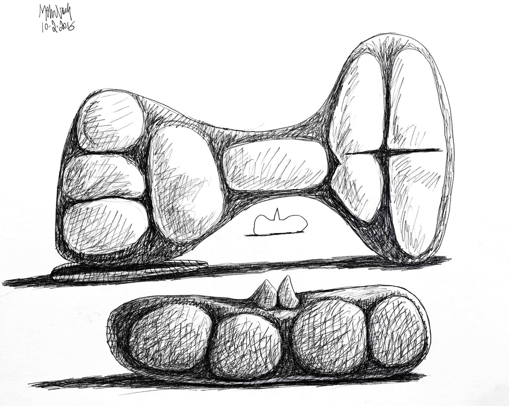 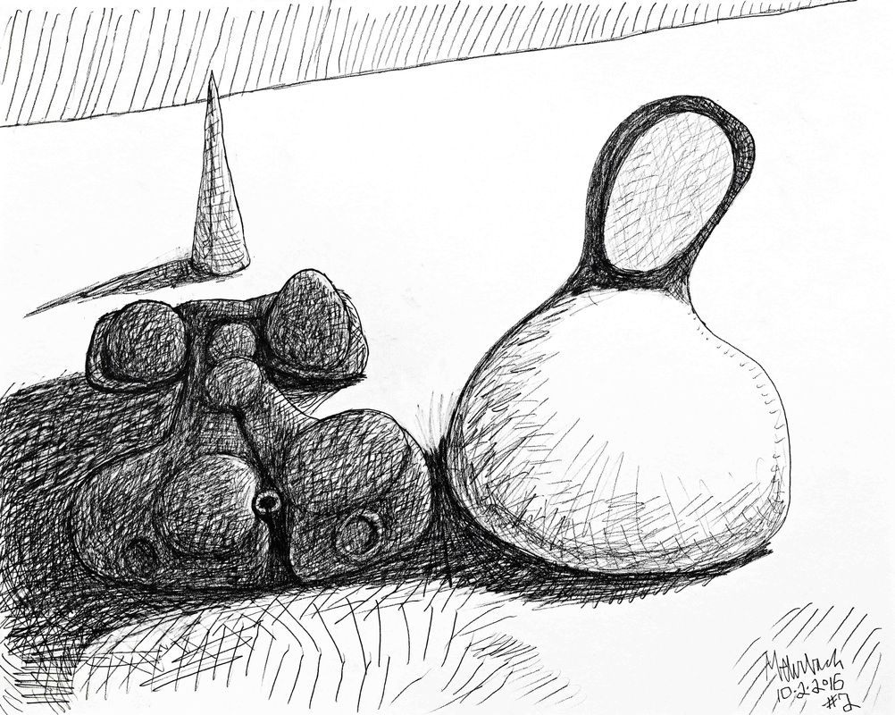  "2016 No.14" (state 2), oil on canvas, 67x58.5" Too high a level of biomorphism bothers me. I believe strong biomorphism forces the viewer to think of animals and insects and extraterrestrial aliens (as depicted in films), rather than clear-sightedly being involved with composition, color, and forms. I want the viewer to visually dive into my art, be consumed by its reality. I don't want the viewer to think about external references. I want them to be here, now. Is this possible? Not completely. We all live in a world of forms and color. Our references are demanding, both intellectually and emotionally. Those who find spiders an emotional conundrum probably see a spider in "2016 No.14" (although it only has four appendages). I see a form stretching itself, forcing the space into three-dimensions. I am hoping this causes spatial tintinnabulation, making the absence of form ring, as if the air itself is alive. This is me trying to enliven the third-dimension of negative space on a two-dimensional plane.  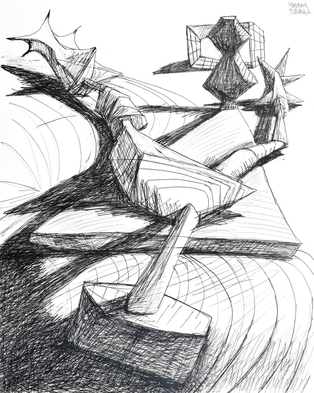  "2016 No.13" (state 1), oil on canvas, 63x58 inches I discovered a new verb today: Chillax! It means "Chill & Relax". I believe yesterday's work denotes behavior similar to the meaning of this compound verb: I am chill-fully relaxing into the basic driving forces of my emotive visual world. There is within me a desire to be figuratively referential, but not too much. I also crave the visual power of three-dimensional space. Together, the reference to a figure, and the reference to three-dimensions, is visually, persuasively, forceful. Some of you may look at yesterday's work and think of the British painter Francis Bacon. I do, and I don't. This is my work. Bacon's is relentlessly figurative, mine is not. Obviously, I, like Bacon, require a means to define abstracted three-dimensions. My images occur within a defined three-dimensional space, contrary to the flat, two-dimensional canvas. 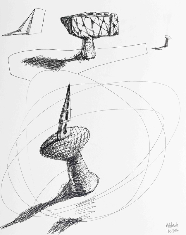   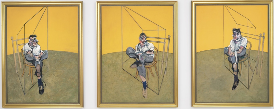 Franci Bacon, "Three Studies of Lucian Freud", oil on canvases (triptych), 1969 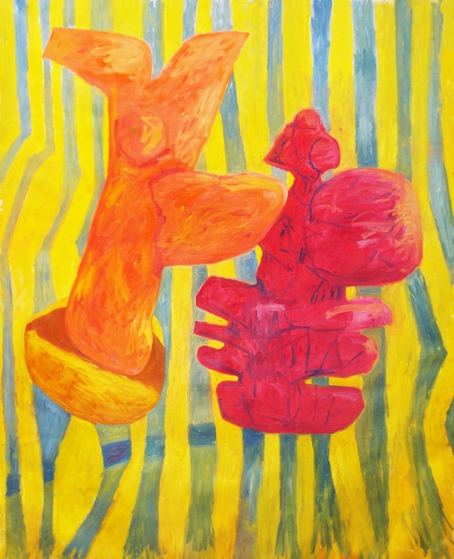 "2016 No.6" (state 6), oil on canvas, 77x60 inches These reproductions were taken by a Nikon COOLPIX L810 16.1MP Digital Camera, just a simple "point & shoot" camera, not a DSLR. I am surprised. The quality of these reproductions is very good. The death of my old Nikon D80 DSLR (vintage 2006) is a good thing. I will be purchasing a new Nikon DSLR, but the quality of the reproductions you see here is adequate. Adequate enough for me to post a second reproduction of the current state of the painting "2016 No.6". Usually I use a polarization filter to reduce glare from lighting, but this camera does not allow a filter. Still, very good with minimal glare. This proves you learn from a mishap. This proves technology moves rapidly forward, and I need to stay up with it. Today you can see me ascending a learning curve in more ways than simple reproduction. Although I do think the current state of "2016 No.6" is better than the last, viewing it makes me miss my fondness for deep space. Thus the drawings I made two days ago, posted here today. I believe I have a major problem to work through (which is a constant). Today's major problem is me, integrating light, color, energy of surface and touch, with my fondness for deep space: Not easy for me. At one point in Willem de Kooning's career, and also, earlier in my career, our paintings went Black & White, sans color. This may have to happen again. At the end of today's post are reproductions of Black & White oil paintings, de Kooning's from 1948 and mine from 1984. Willem de Kooning (1904-1997) was not well known in 1948 (his colorful "Woman" paintings began later that year. Willem de Kooning's "Woman" paintings marked the beginning of his artistic maturity).   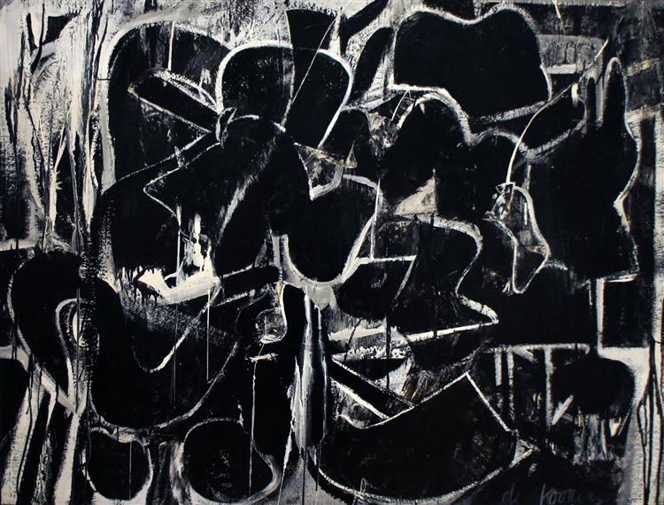 Willem de Kooning, "Painting", oil on canvas, 1948 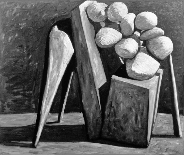 Carl Mehrbach, "3D Abstract", oil on canvas, 1984 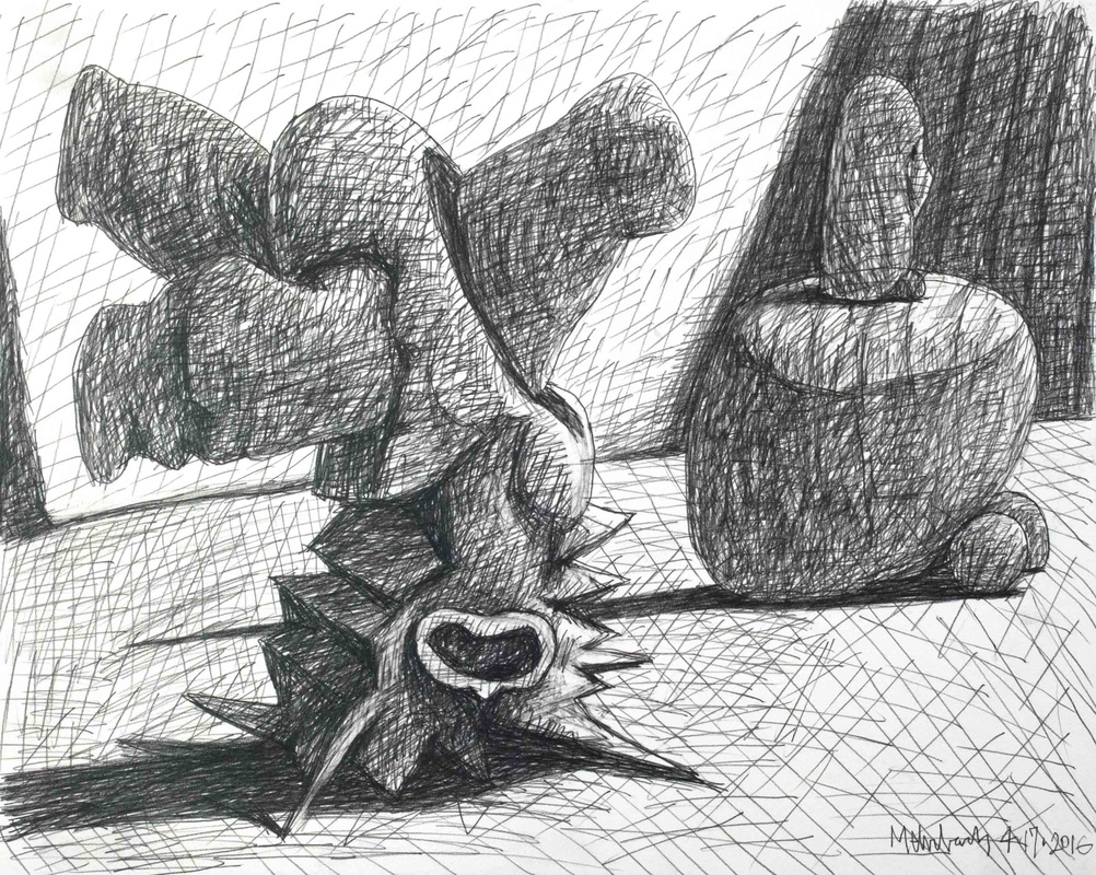 Picasso was compositionally redundant. His use of head-on horizontal space as necessity is deadly repetitive. You never see Picasso stretch space into and out-of the picture plane ― with him it is always across. Think of "Guernica", or even his most robust three-dimensional figures from his Classical Period ("Mother with Child on the Seashore") ― Picasso always composed left-right, across the horizontal surface. With this in mind, I show the horizontally composed drawing I made yesterday. Sometimes I just gotta play with large forms and forget my interest in moving the eye into and out-of the picture plane! 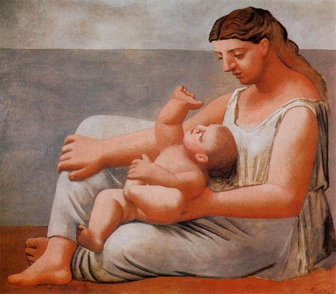 Pablo Picasso, "Woman with Child on the Seashore", oil on canvas, 1921 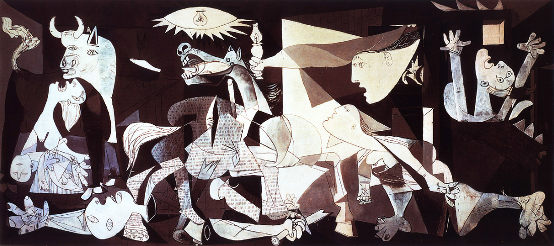 Pablo Picasso, "Guernica", oil on canvas, 1937 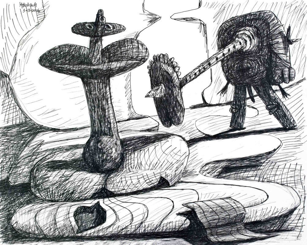 Drawing-03·13·2016, pencil on paper, 16X20 inches Phil Spector, and his "Wall of Sound", has been in recent news. Not because Spector's work, as music producer, is exemplary, but in contrast to the magic that came from the work of the "The Beatles" music producer, George Martin. Martin passed last week. Spector did produce the last Beatle's album, "Let it Be". Martin did the rest and the best. Phil Spector has no influence on me, but looking at the painting "2016 No. 3", perhaps analytical cubism, as exercised by Pablo Picasso and Georges Braque, does. While I was painting I did not think about this connection. When I stepped away, looked at my day's work, it felt obvious. Picasso and Braque faced the same problem as I. How do you make a flat 2D canvas play well with 3D forms? (See one of Braque's solution at the bottom of this post.) This dichotomy, of 2D versus 3D, is an endless problem. Annoyingly, my concern for solving it, makes me feel trapped within the bindings of 20th Century Art when I am here in the 21st Century. I have to deal with it! That is what I tried to do with yesterday's drawing. I am following something deeper than Art History. I am following my intuition, born out of all I know and all I have lived, from education to my worse emotional experiences with my parents. Such is the stuff, and the grandeur, of making art.  "2016 No.3" (Painting-03·05·2016, state 2), acrylic marker on canvas, 52X48 inches) 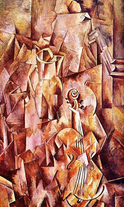 Georges Braque, "Violin and Jug", oil on canvas, 1910 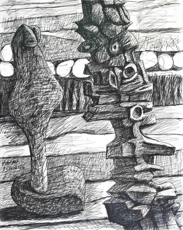 Drawing-03·10·2016, pencil on paper, 20X16 inches This was a week of self-intimacy. Everything I did led to self-acceptance. This can be seen in drawing after drawing. Even the newest painting forced me to accept my basic impulses and interests. I write "even the new painting" because when one looks at this painting my insight is not obvious. What you don't see is how its failure, particularly in the background's lack of rapport with the foreground forms, hit me like a hammer on the intellect. It screams, "This ain't right!" So the obvious problem is me versus the structure with which I must work. The actual structure is two-dimensional, but the visually, emotive structure I place on the 2D paper or canvas is invigorated by its three-dimensionality. I have pointed out in this week's posts, as I referenced Masters like Cezanne and Monet, that I am not alone with this dichotomy. There are models out there, created through lifetimes of work. This brings me squarely into my self-importance. It is important that I pursue this problem which I have begun to address. It is important because it has become incontrovertible that this is the manner I must use to express who I am, the way I see, the way I feel. Yesterday's drawing took another jab at it. I felt exhausted by the end of my studio session, which tells me this has been a week of enervating insights. I am proud, but not happy or satisfied. I have faced the challenge, accepted it as true. There is a vast amount of work to be done!
 Drawing-03·09·2016, pencil on paper, 20X16 inches I am encountering an expected major problem for an artist with my propensities. How do I integrate the background with the robust forms I create in the foreground? This is a problem because of my natural desire to create sculptural forms. Why don't I just make sculpture? I tried that. I did not like it. It takes too much time to manipulate large forms, as well as enormous studio space and enormous cost. There is also color. I love color. I also love to control and manipulate light. Playing with light crossing forms is so much more direct in drawing and painting than in sculpture. So, here I am. I must deal with the inherent two-dimensionality of canvas or paper as I produce artificially drawn three-dimensional forms. To make the actual 2D work well with the artifice of 3D is not an easy task. It took Cezanne a lifetime. I am committed to this. It looks like abstract forms may allow me to research more directly with this 2D/3D problem than having to worry about the efficacy and meaning of actual forms, human or otherwise. At least, that is how I feel today.
|
To read my profile go to MEHRBACH.com.
At MEHRBACH.com you may view many of my paintings and drawings, past and present, and see details about my life and work. Archives
April 2024
|
 RSS Feed