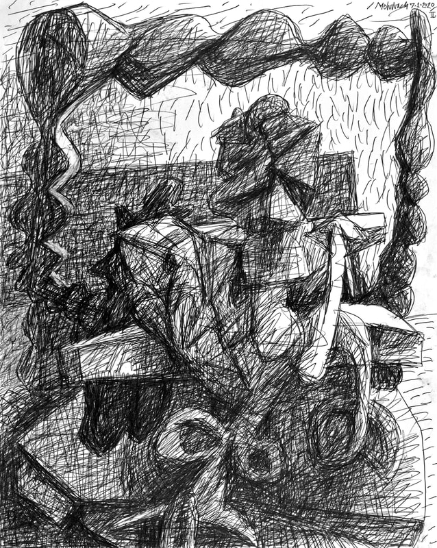
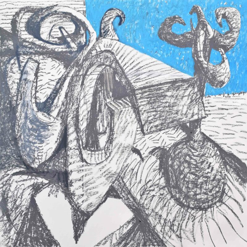
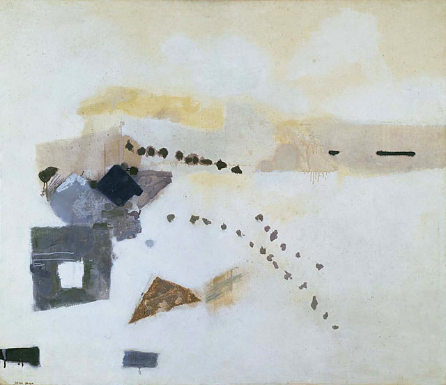
I tend to do too much, not too little. The title of this painting is down to one word. With this change I have abandoned titles using quotations. I have quoted from literary figures in order to find my own place within space and time, but I don't require that anymore. Simple is better because the paintings speak for themselves, they don't need a crutch of words to lean upon.
This painting, "Uphill", still bothers me. Perhaps I love that ball at the top of hill too much. I am trying to accommodate it, but its instability rocks my confidence. Something needs to be altered. ![]() "Silence, Exile, and Cunning" (2022 No.1, state 9), oil on canvas, 49x57 inches, {"I will not serve that in which I no longer believe whether it call itself my home, my fatherland, or my church: and I will try to express myself in some mode of life or art as freely as I can and as wholly as I can, using for my defense the only arms I allow myself to use, silence, exile, and cunning." - James Joyce (1882-1941), "A Portrait of the Artist as a Young Man" (1916)} Yesterday "Silence, Exile, and Cunning" changed; it is incomplete. Everything needs to come together. The discord in the upper left must be resolved.
I feel uncomfortable with this drawing. It looks alien, yet I made it. What was I thinking? Discomfort is not necessarily unacceptable, nor does it make this drawing substandard. But, I gotta wonder, "Why the discomfort?"
Pablo Picasso is known for his precise language, as well as precision in his art. I agree with much of what Pablo says. (Below, see Picasso's take on the inherent blindness of art-making and art-interpretation.) John Lennon wrote, "Happiness is a Warm Gun." I say, "Happiness is a Warm Pencil." Do I draw too much? Making marks is addictive, cathartic, warm, and clarifying. My drawing makes sense of my reality; others may find my art blind to the discomforts that are present in our political and social world. No matter; I probe my own depths. I am wide enough, deep enough, to be eternally in need of work; I am preoccupied with myself; I am working to understand. The reward? Me knowing more the more work I do. Subsequently, I feel enlightened, optimistic, and busy. There is much to do; I am solving my own mystery, which is the result of the mystery that is the world I live in. Yesterday's drawings are robust, clear, and confusing. They are like real-life. Pablo Picasso on Art-Making: Even to me, yesterday's drawing sings a radical message. It conserves Western's Art's intrigue with perspective, yet creates a room-like environment inhabited by a form of many forms. It has little comfortable references to reality. This is pure three-dimensional abstraction, simultaneously conservative and radical. Viewing discomfort abounds! Is it good art? It is what it is: a test, a proving ground, research, and profoundly articulate. This drawing is filled with finesse of touch and of pencil marks. It exudes elegance in form-creation and in composition. Yet, it is disturbingly different; it is different than anything I have imagined prior to its existence. My role is not to judge, but to make, then move on to create some more.
Risk is going to uncomfortable places. Yesterday I forced myself to minimize my marks between forms. This was difficult for me because this is not something I have explored well. I uplifted my consciousness: I forced my self to allow a lot of negative space between forms in yesterday's drawing. You can also see me thinking this way in the upper right of the painting "Doublethink". One master of negative space is Kenzo Okada (1902-1982). Below is Okada's 1954 painting, "Footsteps". Whatever you see in this drawing I see a reverse triangle that instigates great compositional vigor. I have noted before that Picasso utilized a tried and true center triangle in his masterpiece Guernica. Picasso's triangle is so forced as give the viewer boredom after multiple viewings. This highest clarity of composition does allow Picasso to invent incredibly rich, novel, and greatly emotive forms. It allowed Picasso to perform with intuitive abandon on a rigidly organized frontal compositional assault. Marvelous it is that Picasso absorbs the viewer in the active emotional strife of his characters. These hurt and screaming figures reside comfortably within a securely balanced image. Security versus chaos is Picasso greatest theme. Giving the viewer security, so they may feel comfort while they view chaos, is the reason I am deeply influenced by Picasso's best paintings, drawings, and prints. Returning to my drawing of yesterday: What I have called a "reverse triangle" can be found with one of its points cut at the bottom of my drawing. It moves the viewer up and around the two major forms on the right. Those forms, juxtaposed as they are by spherical versus cubic centers, each play with dissimilarity against the other. This occurs comfortably because they reside nicely in a secure, upside-down triangle. To be absolutely correct, there is no triangle there! My "reverse triangle" has its bottom point cut to flatness. Mathematicians call this shape a trapezoid. Who's there? Not who you think! These are abstract images, yes, but they are also non-representational. The visualization is emotionally referenced, but not unkind or aggressive, just exploratory. That said, the spatial play, insisted upon in these drawings, is robust. One can follow the floor via shadows and marks. The outgrowth of forms above the plane is scary. The unease within these drawings is, to me, like hovering over a chasm while walking on a rope bridge. I am surprised by my personal discomfort. Is this a good thing? I don't know. When a viewer engages with Picasso's Guernica, or one of the more emotive self-portraits by Van Gogh or Rembrandt, is feeling safe important? Revelatory they are. Representational works are more direct than the drawings I show you today. Representation in Guernica, or in a self-portrait, is obvious. Do not take the images represented in my drawings as obvious!
The disjunction between the left and the right of the painting "2017 No.3" horrifies me. Is that good? Is that the right emotion? Intuitively I think it will beget a better response if I place a spot of red on the left side. I do use Ivory Black, which is a warm black. That helps, but it begs for more warmth. Tried and true color theory says the color wheel implores completion. The primary color missing in this painting is red. Adding red is a comfortable solution. Adding a spot of red would reduce this painting's discomfort, but is it the right thing to do? Yesterday's drawings also utilize separate panels within one image. I have always been interested in multiple panels, multiple images, for several reasons. Disparate images request intellectual and emotional unification. Viewers do this spontaneously. The human mind questions without reservation. This absolute need to put together the most disparate of ideas intensely engages the viewer. It is NOT a new idea. Several artists of my generation have done this, none more repeatedly than David Salle [below are reproductions of two of Salle's works, one early in his career (1983), and one from 2016]. Notice, in Salle's paintings the color wheel is comfortably completed, making more comfortable the disparate images. The beginning of this year's first painting looks like the detail of a larger painting. It is definitely far from completion. It surprises me with its coldness. It is cold here, below zero Fahrenheit today. This said, yesterday's drawing has warmth. Is that a tropical plant? So despite the freezing weather, and the cold in me, there is hope. I am warming to myself in this New Year. I think this year portends success. Yesterday I set the studio temperature to remain warmer overnight, warmer than usual. I won't have to wait till late afternoon for it to be comfortable in there. My hands were cold most of yesterday. Optimism survives!
|
To read my profile go to MEHRBACH.com.
At MEHRBACH.com you may view many of my paintings and drawings, past and present, and see details about my life and work. Archives
June 2022
|