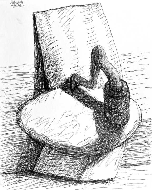
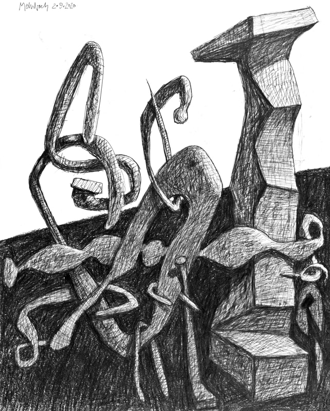
 Drawing 04·25·2020 No.1, pencil on paper, 20x16 inches 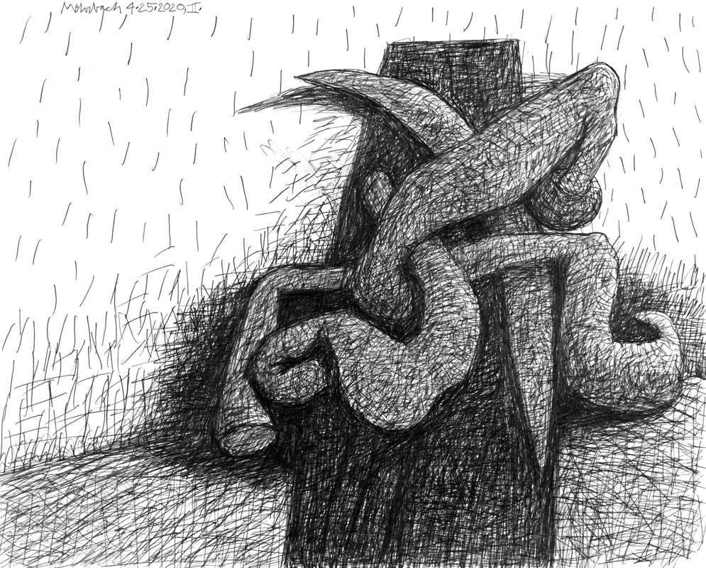 Drawing 04·25·2020 No.2, pencil on paper, 16x20 inches Am I using the word, Wonky, correctly? The dictionary's second definition is, "having or characterized by an enthusiastic or excessive interest in the specialized details of a particular subject or field." Well then, yes, I am! I am producing head-on, fully-emotional, fully-intellectual, fully-classical, and absolutely viewer-engagement-oriented compositions. There is no fooling around in these drawings! These are wonky at their best, one after another, all wonk! These are detail oriented compositions. They engage using flat, in-the-viewer's-face, emotionally-instructed forms. Their classicism is their left to rightness, their up and downess. These drawings create the artifice of three-dimensional space, but their 3D-ness is second fiddle to their compositions' 2D formal classicism. Pablo Picasso understood this; Picasso understood classical compositional power better than anyone. The most complex of Picasso's images hit the viewer with the flattest of compositional insistence. See below: Take a look at one of Picasso's most complex paintings. Isn't is easy to read? This painting by Picasso is enticingly, head-on, flat? Enjoy! It is time for me to stop fighting the obvious! Picasso gave in; I also have decided to give in to the obvious. To drive my point home I show one more painting by Pablo Picasso; this one from Picasso' so-called NeoClassical Period, when the artifice of 3D space was moderated by their 2D Classical Compositions! (Below, see "Pipes of Pan", one of my favorite paintings by Picasso!) 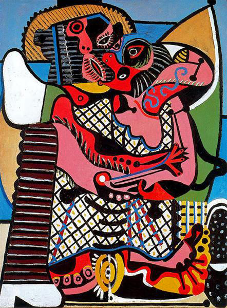 Pablo Picasso, "The Kiss", oil on canvas, 130.5x97.7 cm, 1925 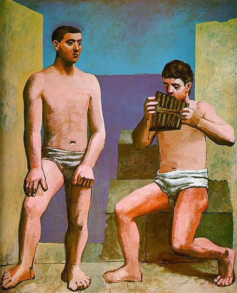 Pablo Picasso, "Pipes of Pan", oil on canvas, 205x174.5 cm, 1923 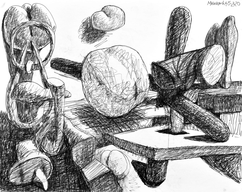 Drawing 04·05·2020, pencil on paper, 16x20 inches Yesterday's drawing combines many of my interests, from round to flat to three-dimensional artifice to compositional carry-through to light and energy to contrast in value and form. The 3D deception is robust. Formally, this is a success, but is it an emotional success? I worry it feels more an intellectual achievement than a grand display of all things me, i.e., emotions and intellect. Not to worry; this is merely a step along to way to all-inclusiveness.
 Drawing 02·09·2020, graphite on paper, 20x16 inches  "Something Else Entirely" (2019 No.4, state 21), oil on canvas, 38.5x62.5 inches {"And you’d spend years trying to decipher the sentence, until finally you’d understand it. But after a while you’d realize you got it wrong, and the sentence meant something else entirely." - Tadeusz Dąbrowski, from the poem "Sentence"} I do not know what I do not know. There are all kinds of ways to create depth and internal energy on a flat surface. I am working toward that, but look (below) at this painting by Julie Mehretu! Mehretu condenses and releases form. Her work is a revelation to me. In my drawing, the one I show today, I play this way too. However, the depth in Mehretu's "Stadia II" is far greater than that which I create is either of my works shown in this post. In "Stadia II" Mehretu creates depth by use of perspective lines at the bottom of the canvas, and smaller forms at the top. Depth is forced in other ways too. The clogging of darker forms at the top forces the eye to think hanging banners (like in a basketball stadium); the eye passes underneath those banners, back to the gray forms that reside (artificially) behind them. This is an exciting, masterful vision; one that creates a robust vision of three-dimensions on a two dimensional surface. To see Mehretu's mid-career Retrospective, visit the Whitney Museum of American Art (June 26 — September 20) or the Los Angeles County Museum of Art (now through May 17). 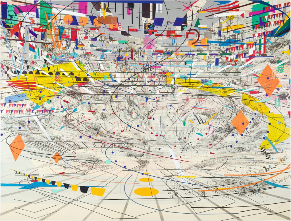 Julie Mehretu, "Stadia II", 2004, ink and acrylic on canvas, 9x12 feet 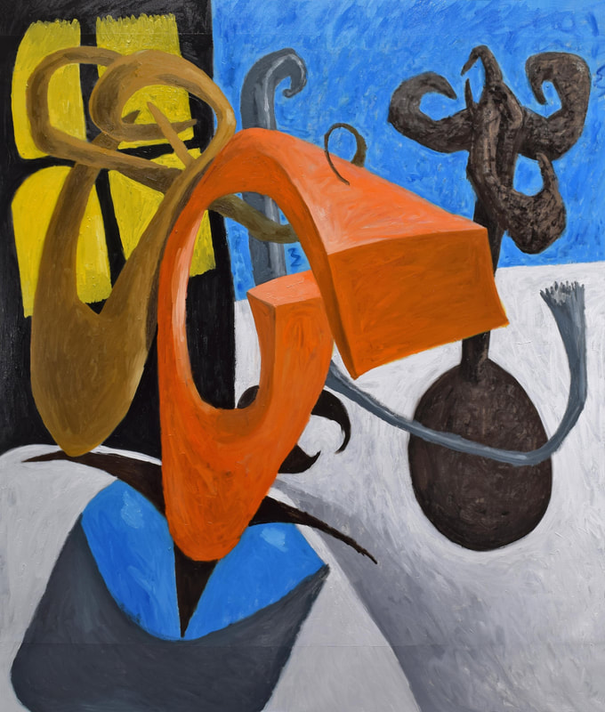 "Doublethink" (2019 No.3, state 7), oil on canvas, 68x58 inches {"Doublethink means the power of holding two contradictory beliefs in one's mind simultaneously, and accepting both of them." -George Orwell, "Nineteen Eighty Four" (1949)} 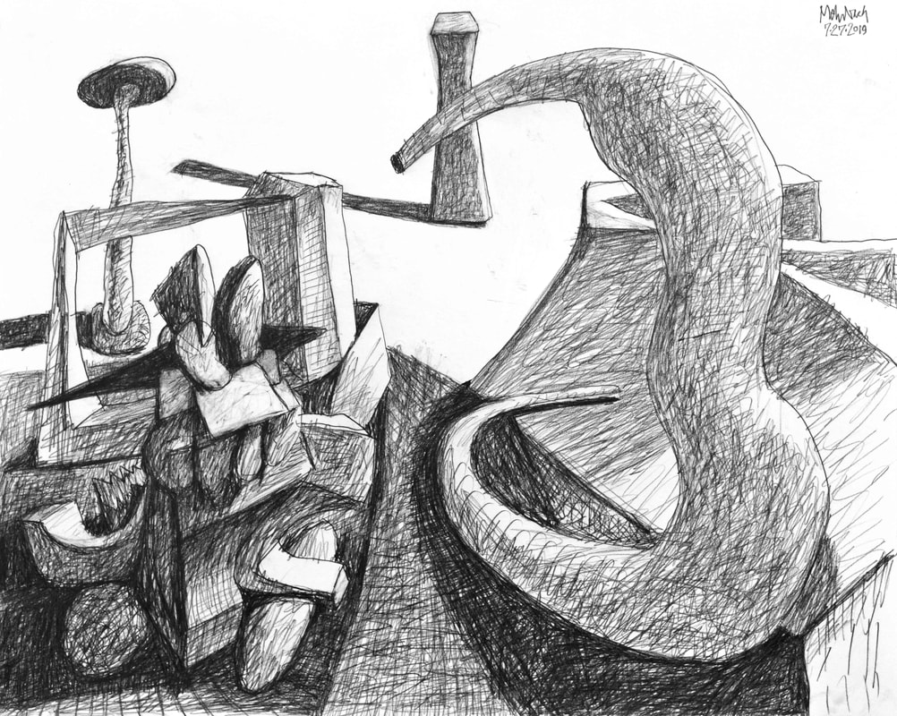 Drawing 07·27·2019, pencil on paper, 16x20 inches Part IV: Flat on Flat versus 3D on FlatI prefer to deal with the artifice of the third-dimension on a flat surface, on canvas or paper. This is obvious in my images; obvious in the two works I show from yesterday's studio session. Henri Matisse constantly dealt with this problem. Many have said Matisse's art is mostly decorative. It is more than that. Matisse himself said this: "What I dream of is an art of balance, of purity and serenity, devoid of troubling or disturbing subject matter, an art which could be for every mental worker, for the businessman as well as the man of letters, for example, a soothing, calming influence on the mind, something like a good armchair which provides relaxation from physical fatigue." That sounds like decoration to me! Matisse also said this: "Expression, to my way of thinking, does not consist of the passion mirrored upon a human face or betrayed by a violent gesture. The whole arrangement of my picture is expressive. The place occupied by figures or objects, the empty spaces around them, the proportions – everything plays a part. Composition is the art of arranging in a decorative manner the various elements at the painter’s disposal for the expression of his feelings." I agree with the second quote from Matisse more than the first. Expression is my desire too. However, I do not believe this (from Matisse): "Composition is the art of arranging in a decorative manner...." It is far more difficult that that. Expression is far more than decoration. It can be tough and caustic, clean or messy. I continue to research this problem. Let me show two works of Henri Matisse. One tough, filled with three-dimension references, the other absolutely decorative, absolutely flat on flat (see below). I have tried to prove my thesis, that the artifice of the third-dimension can produce superior, more expressive art. than flat on flat. These two works by Henri Matisse are undeniably terrific and expressive. Of the two, I prefer the former. They are both decorative, but they are both bold and expressive as well. Kudos to Henri Matisse! I will continue to research self-expression through the use of three-dimensional forms on a flat canvas. I intuitively feel this method will bring me far past the expressive limitations of flat on flat. I must say is, "I am not Henri Matisse!" I admire Matisse's art, but I admire myself more. 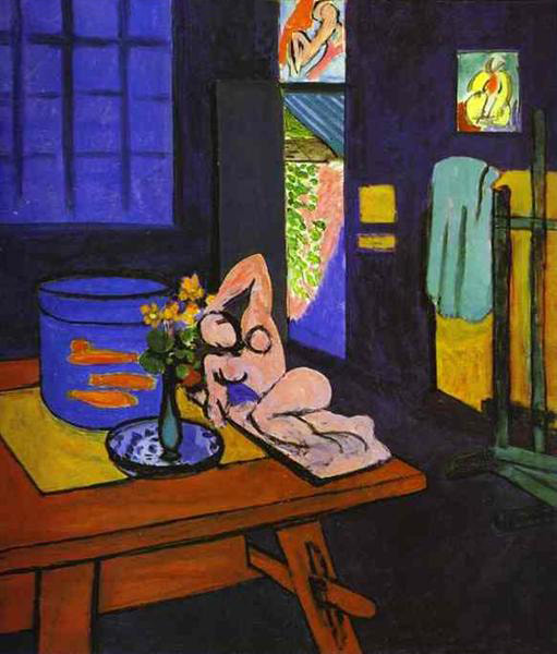 Henri Matisse, "Red Fish in Interior", oil on canvas, 1912 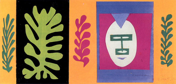 Henri Matisse, "The Eschimo", paper on paper, 1947 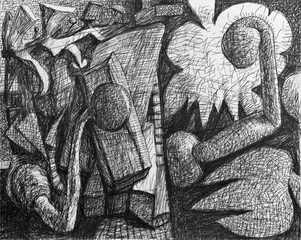 Drawing 02·07·2019, pencil on paper, 16x20 inches It will happen shortly. My art will be due at galleries for exhibition. This fact hit me hard last week. I negotiated final dates and works to be exhibited. Stay tuned for more information. I have three exhibits scheduled this year, and more possible. My first exhibit begins in Late April.
Exhibiting is confusing to me because it comes with good, bad, and ugly. Bothersome it is to my most important activity, my most fulfilling activity: The making of art itself. The drawing shown here is from two days ago. It is a complex and excellent drawing. There is a push/pull of three-dimensional space, excellence in value contrasts, and a robust, active composition. 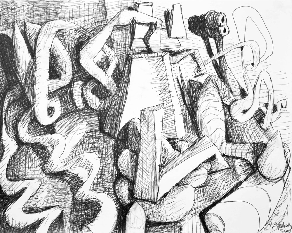 Drawing 09·20·2018, pencil on paper, 16x20 inches Never! Always! The edge of description is life as animated joy. Henri Matisse did it before anyone else. Matisse's Joy of Life is a grand display of compositional stress and color invention; it depicts the joy in creation. Joy of Life is reality itself. Joy of Life is based upon that which we see, i.e., the reality we know; the flat plane of the canvas is respected while three-dimensional-perspective is forced and enforced. Around and around we go, in and out we see. It is more than a test of compositional possibilities; it plays with simple contrast too, light to dark. Joy of Life is one of Henri Matisse's most important contributions to painting and the visual arts. I set about yesterday's drawing with Joy of Life in mind. My drawing achieves a high level of compositional energy, and rigor; in two-dimensions and in three-dimensions. Also, it runs with wild circles around its solid, anchored center. 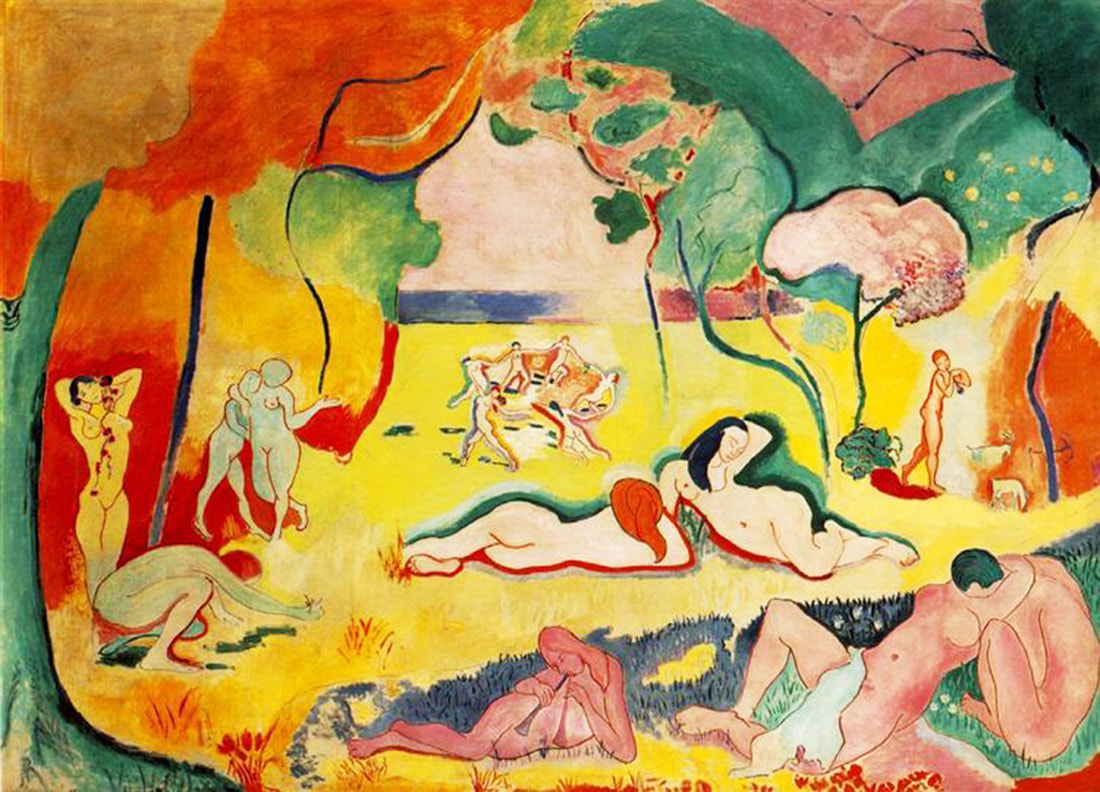 Henri Matisse, "The Joy of Life", oil on canvas, 175x241 cm, 1906 |
To read my profile go to MEHRBACH.com.
At MEHRBACH.com you may view many of my paintings and drawings, past and present, and see details about my life and work. Archives
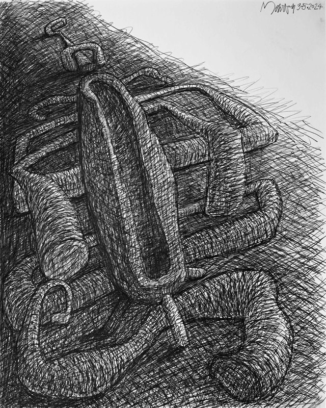
April 2024
|
 RSS Feed