|
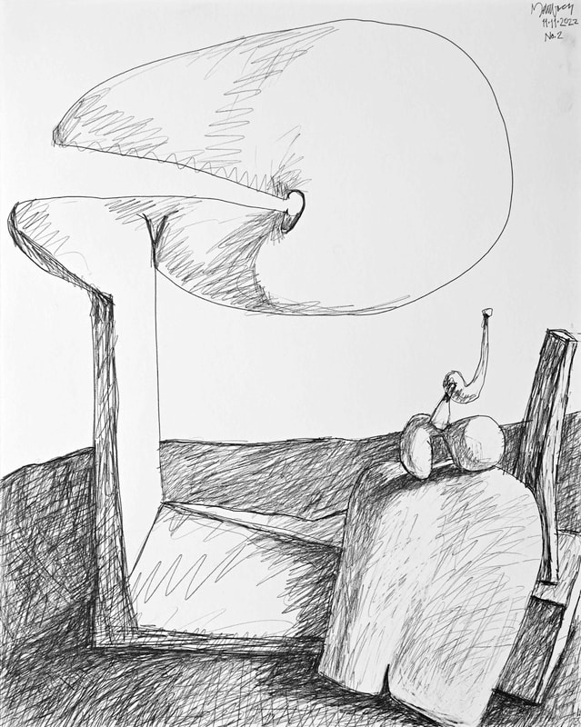
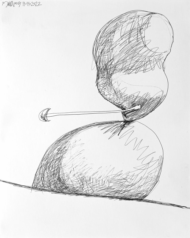
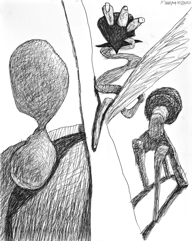
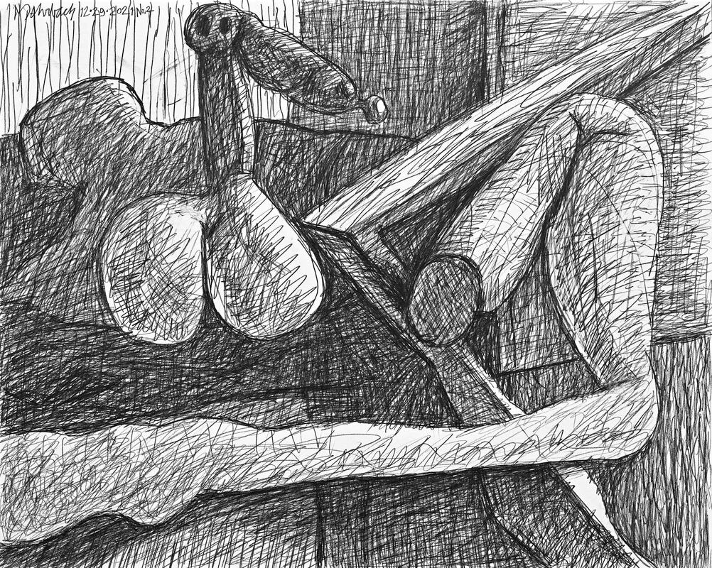
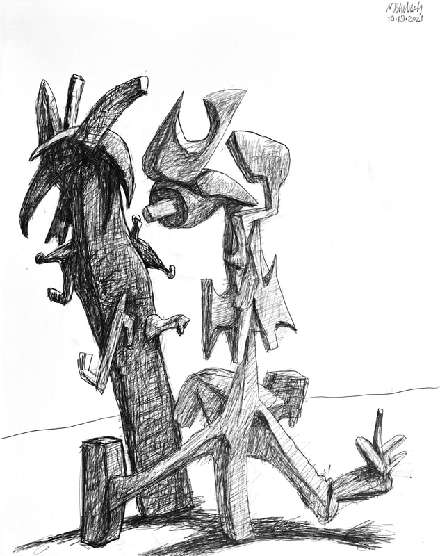
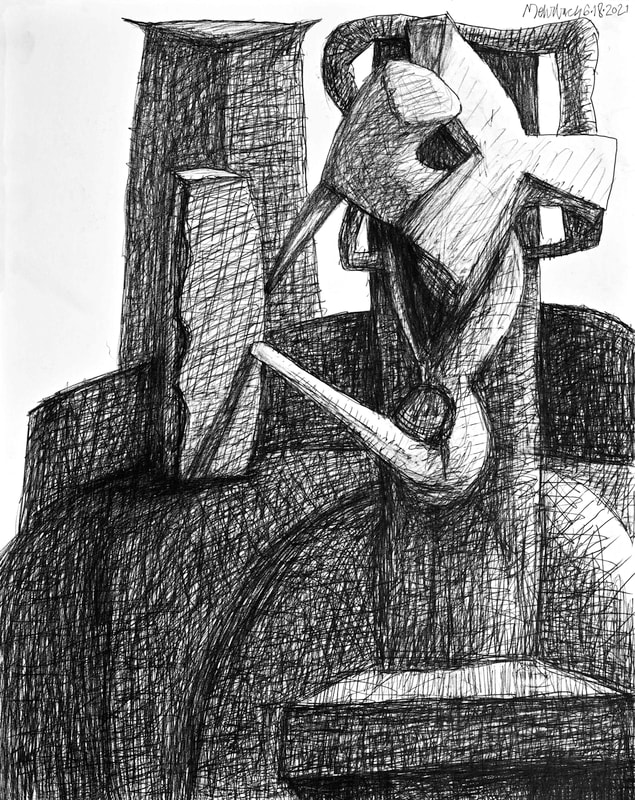
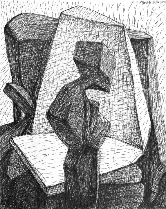
By drawing I am practicing touch and flow. It is here I an undergoing sensitivity training. The dynamics of value, form, and space (negative and positive), are within me; I am practicing making them outside of me. I am an athlete in training. I am sharing my sensitivity with you. These two drawings are among my very best. Most interesting is the technical aspect of centered composition, which is especially true in drawing No.2. Centered compositions were Picasso's default. A wide range of play in form, value, and space are allowed when centering is achieved. Centering grabs the viewer. When viewer is secured, the possible journey is wide and long, a fullness of dynamics and emotions are allowed.
Positive forms are always important. Balance of negative and positive can occur when negative space is recognized as brilliantly important. Negative/positive balance does occur naturally, from atoms to the earth's environment. These drawings illustrate my embrace of balance. Terrible is the result when things are out of balance; witness global warming.
Color balance brings harmony to a composition. Dynamic color imbalance causes disturbing emotional reactions, which may be useful to self-expression. Negative/positive space imbalance should be explored for self-expressive purposes. I want my Art to simultaneously contain purity and emotive complexity. Are they mutually exclusive? I believe Mark Rothko, and Ellsworth Kelly, have proved otherwise. And... they are not the only ones.
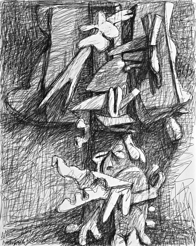
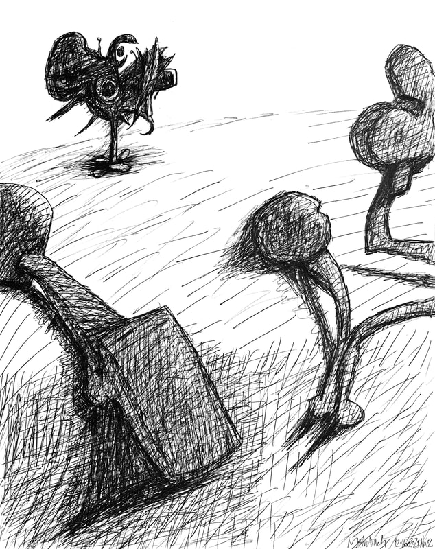
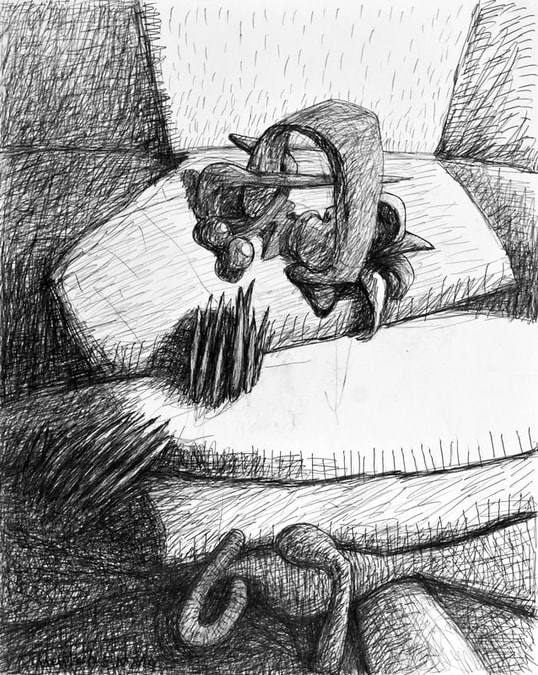
Negative space is paramount as emotive structure. Positive forms share responsibility; forms must be profoundly, attentively complex, while positioned sparsely within negative space. Yesterday's drawings continue my research into this dilemma, purity versus emotive complexity. I very much like this drawing. I very much liked the last drawing I made on 10/15/2021. They are very different. This one contains two strong, complex forms; these forms are against a blank background, except for a simple line to delineate a horizon. The one from 10/15 I called an "all-over" drawing. This one spares marks from the white background. These drawings illustrate a method. I see myself go back and forth, not by design, but by challenge and need. Both drawings are conscious of the entire rectangle they sit within; but, they handle the flat piece of paper in very different ways.
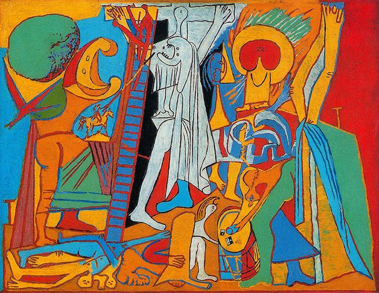
The force of my will made this one. It is apropos of my need to grab your attention, grab my attention. I center you, I center me, by using strong vertical forms. Somehow, when I was finished with this drawing, I was reminded of Picasso's "Crucifixion" from 1930. I believe it to be one of Picasso's most remarkable works, different as it is in color, space, and forms from anything else Picasso. Yes, in this crucifixion there is relationships to everything Picasso had done, and would do, but Picasso's approach here is quite different. The viewer is centered by the light-valued blue of the Christ figure and his distraught mother. After this centering, the viewer can wander, be continuously surprised by the complete animation, the literal references, within the composition, one after the next. My drawing is simpler, yet equally haunting. This bring me to the question of background. There is blank paper in my drawing. Does that work? I usually like to touch every surface. I usually feel the need to identify every part of my paper's surface as part of my space, my time, and my composition. That did not happen in this drawing's background. Does it work? There is a bold, forceful grab here: the viewer is captured by strong, vertical forms, I do believe the white paper ground serves its contrasting purpose. I see the white as definitive space; it is the flat plane in front of which the rest of the composition resides. Notice how Picasso dealt with his background and the negative space; four flat colored areas: blue, yellow, orange, red. Is the viewer bothered by these unidentifiable spaces? No! Instead the multiple compositionally positive forms grab and install the viewer within the composition. The forms are strong enough to support the vague spaces and surfaces Picasso's flat colors depict. This drawing looks better here, in reproduction, than in person. That is unusual. Perhaps it is the up close and personal perusal that brings intimacy to this confusing image; confusing in person, intimate in reproduction? Yes? In any case, I believed I had failed to accomplish my goal. I wished to make every stroke of this pencil drawing relate to every other stroke. I wished the negative and the positive spaces to emote with, and against, one another. Here, in reproduction, I believe I approached my goals. Here, the viewer sees the obvious centering of this composition. The strong center allows the repetitive surrounding swelling forms to sing a tune in harmony, a tune that is the bass beat behind the main theme.
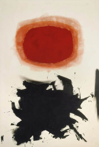
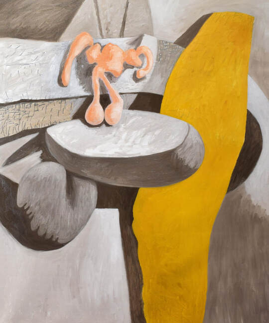
Adolph Gottlieb's works have always fascinated me. I know why. I am struggling fro self-expressive potency; my images never fully satisfy me. Gottlieb's works use a simple formula, over and over. Gottlieb uses a round, cleanly organized shape in contrast to an explosive, jumbled shape; in addition, his images exude positive-shape intensity against supportive, residual negative space. The positive shapes are rich, the negative space lends them fierce interest. This contrast, of shapes and space, sings a potent, emotional message. I do not make flat shapes. My complex, three-dimensional forms have greater opportunity to sing emotions than do Gottlieb's simple, flat shapes. I will stay my course. Gottlieb's simple formula educates; his formula lends charge to visual imagery; his exude husky, emotional responses. In this regard, I believe I can go further than Gottlieb. Adolf Gottlieb's limited formula has instructed me; simple contrast has great possibilities; obtaining more accurate self-expression is possible! Chemistry and Physics students are taught of the oppositeness of electrons and positrons — these particles are equal in all ways, size, mass, charge, except their charges are opposite. The positron is the antiparticle, or the antimatter counterpart, of the electron. The positron has an electric charge of +1 e, a spin of 1/2 (the same as the electron), and has the same mass as an electron. When a positron collides with an electron annihilation is the result; this annihilation produces two or more photons. It is these photons I am trying to create. The photon is a type of elementary particle. It is the quantum of the electromagnetic field, including electromagnetic radiation such as light and radio waves, and photons are the force carrier for the electromagnetic force. Photons are massless; they always move at the speed of light in vacuum. I am trying to move you, the viewers of my art, at the speed of light, with the force of photons. Yesterday I took another step toward this objective. Both the painting, and the drawing, I show today are quickly forceful because they harness the emotional effectiveness of positive versus negative space.
Yesterday, while in the studio, I heard Samin Nosrat say, "I actually like constraints. I think it makes us more creative." Samin Nostrat is the author of the cookbook, "Salt, Fat, Acid, Heat".
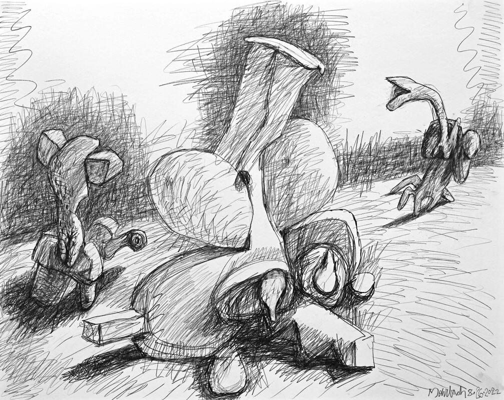
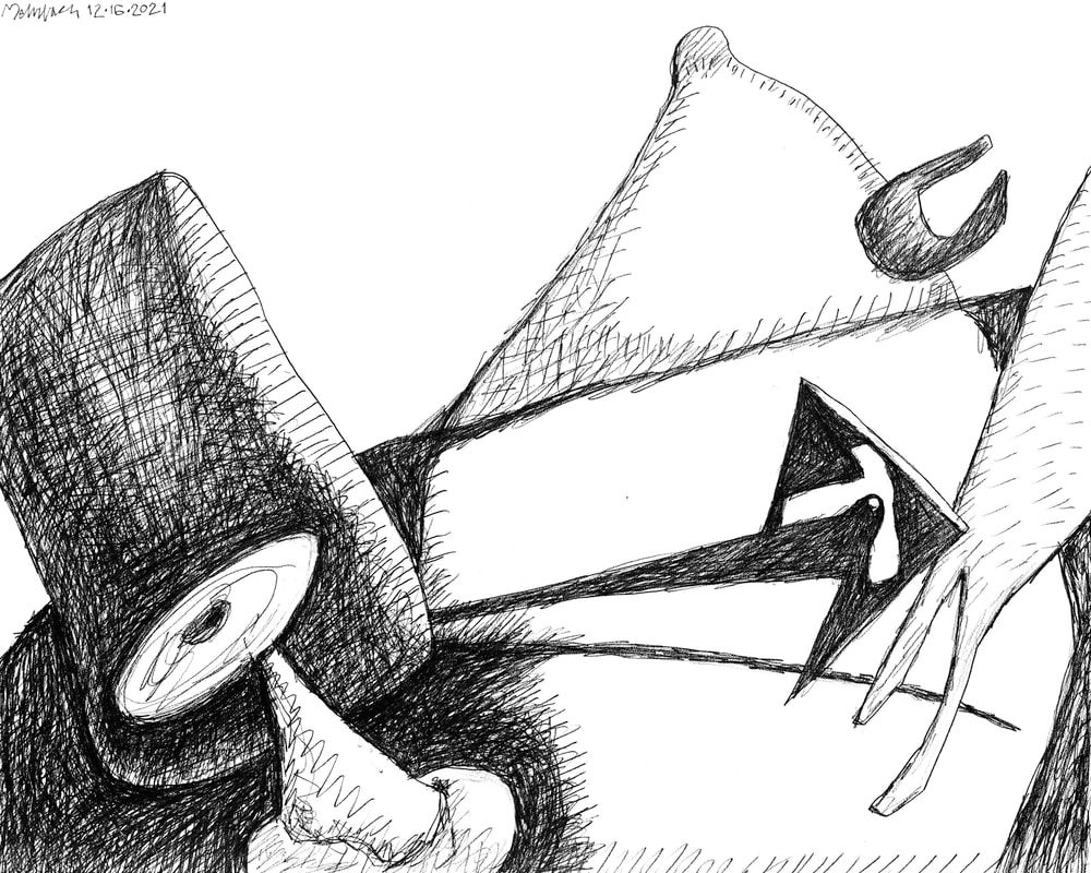
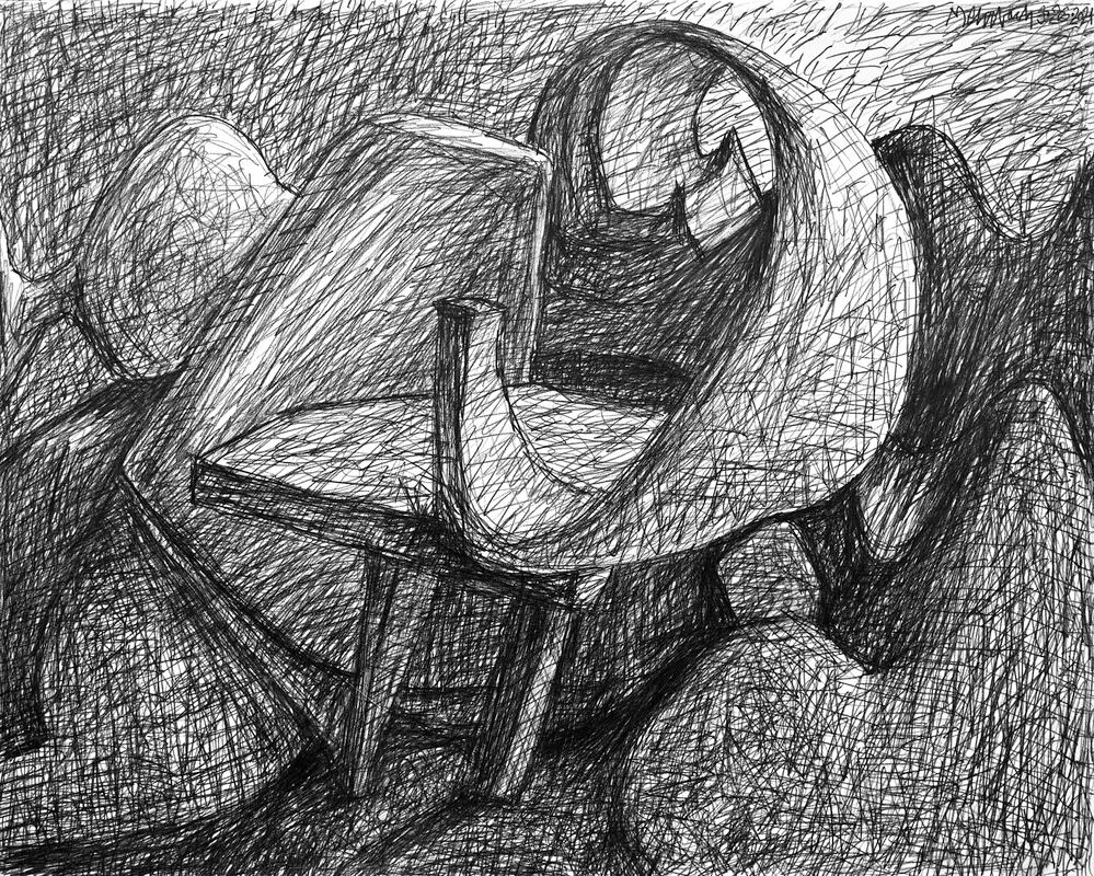
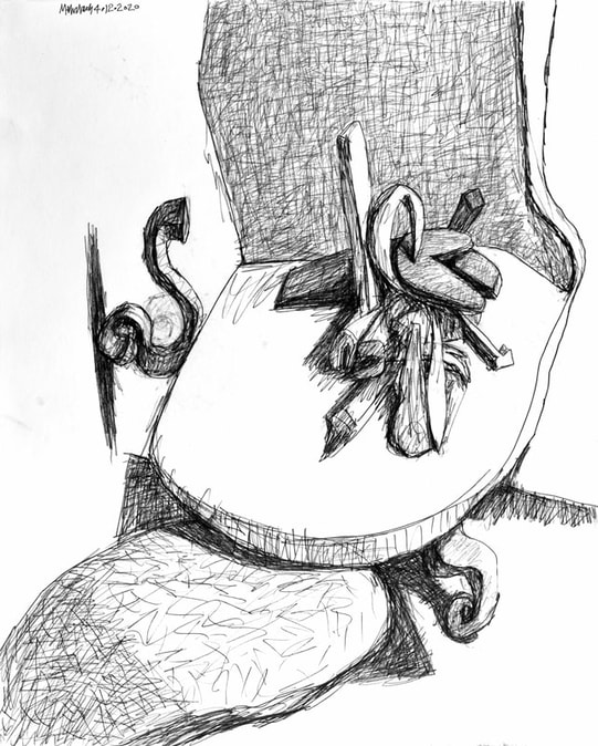
We are all living in a time of home restriction, personally centric space, and social distancing. What remains is isolated creativity. Exhibits are cancelled. Galleries are shut. I am in the studio. I made this drawing yesterday. It moves toward an emotive realization of space: negative, positive, two dimensional, artificially three-dimensional. It is in contrast that makes for emotion; negative versus positive, and real two-dimensional space versus the artifice of three-dimensional space. This take I show today, this drawing from yesterday, moves closer toward my recent creative insight: I am moving toward robust expression of all I am able to express on a flat two-dimensional surface. The constraint of aloneness is good for finding my truth; right now, our world insists on the loneliness of self-dependence for self-expression. Over the last weeks I have taken risks. I have made many drawings, most very different than the image I show today, Yesterday's drawing is a result of that search, a search through nonsense and failure and some success. I have been in the process of sorting out authentic emotive and intellectual representation, sorting it from the nonsense that resides in my head. For me, nonsense must be seen to be recognized as nonsense; then it can be tossed away. This is my creative process. I like the drawing I show today because it is closer to my personal reality. Making falderal is easy. Making substance is difficult. This drawing has substance. |
To read my profile go to MEHRBACH.com.
At MEHRBACH.com you may view many of my paintings and drawings, past and present, and see details about my life and work. Archives
July 2024
|
 RSS Feed